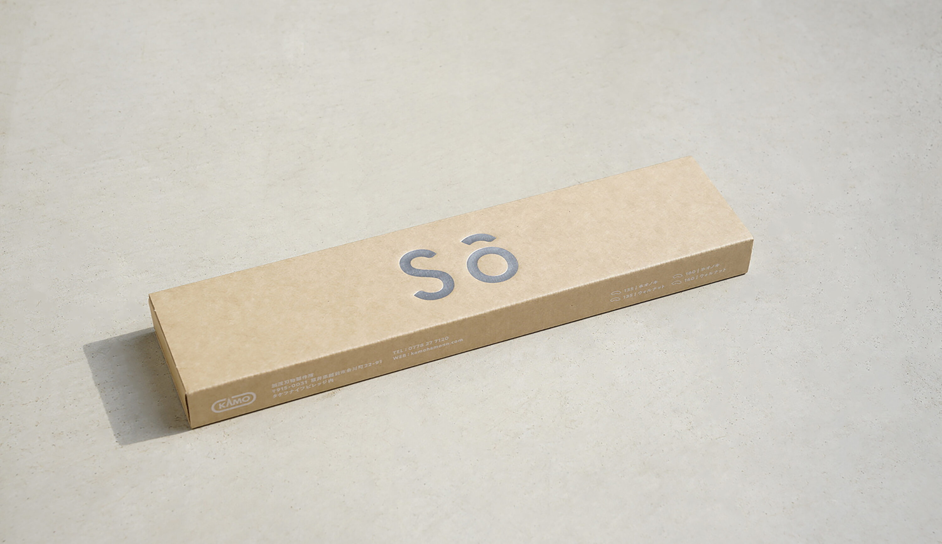
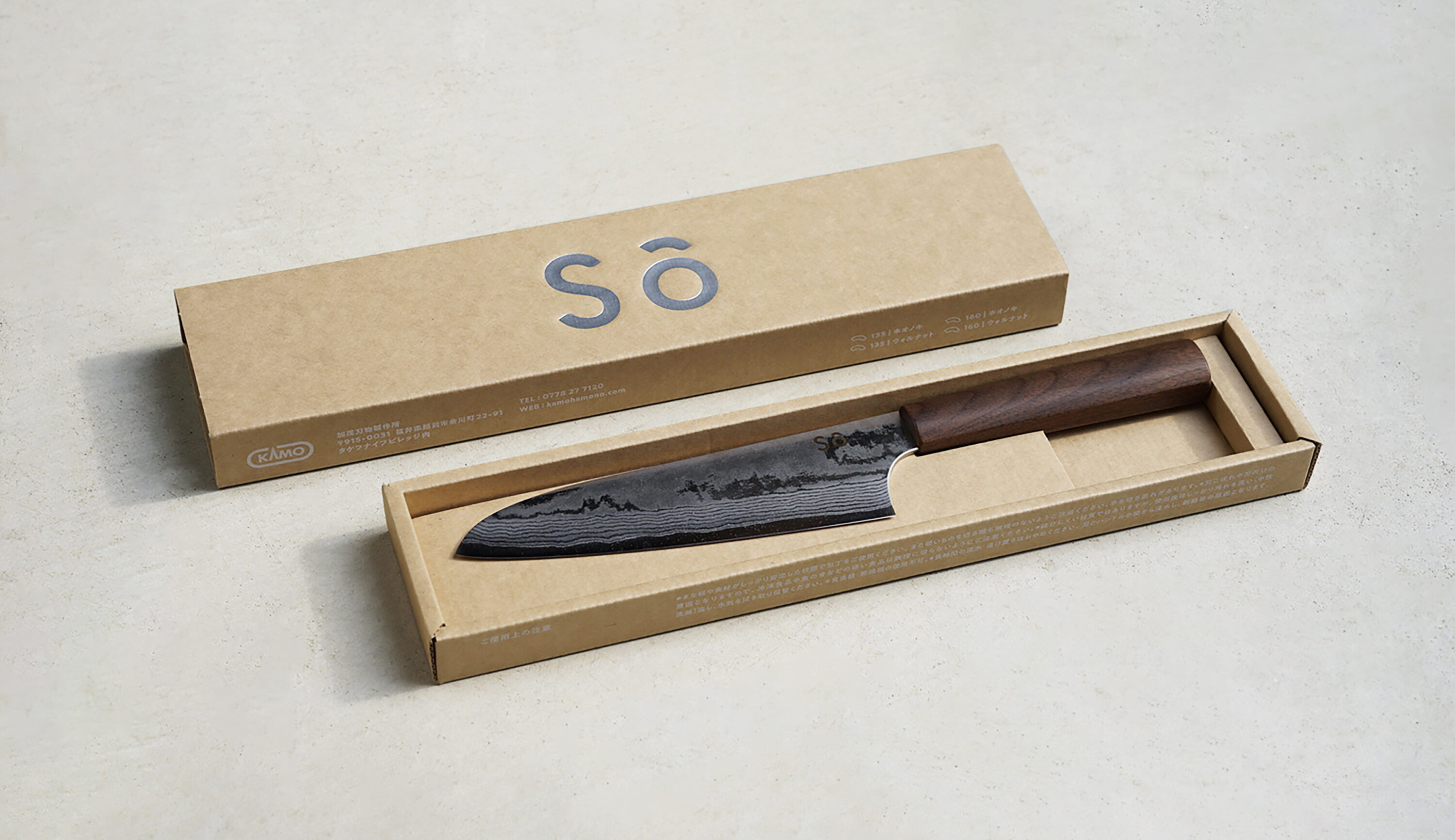
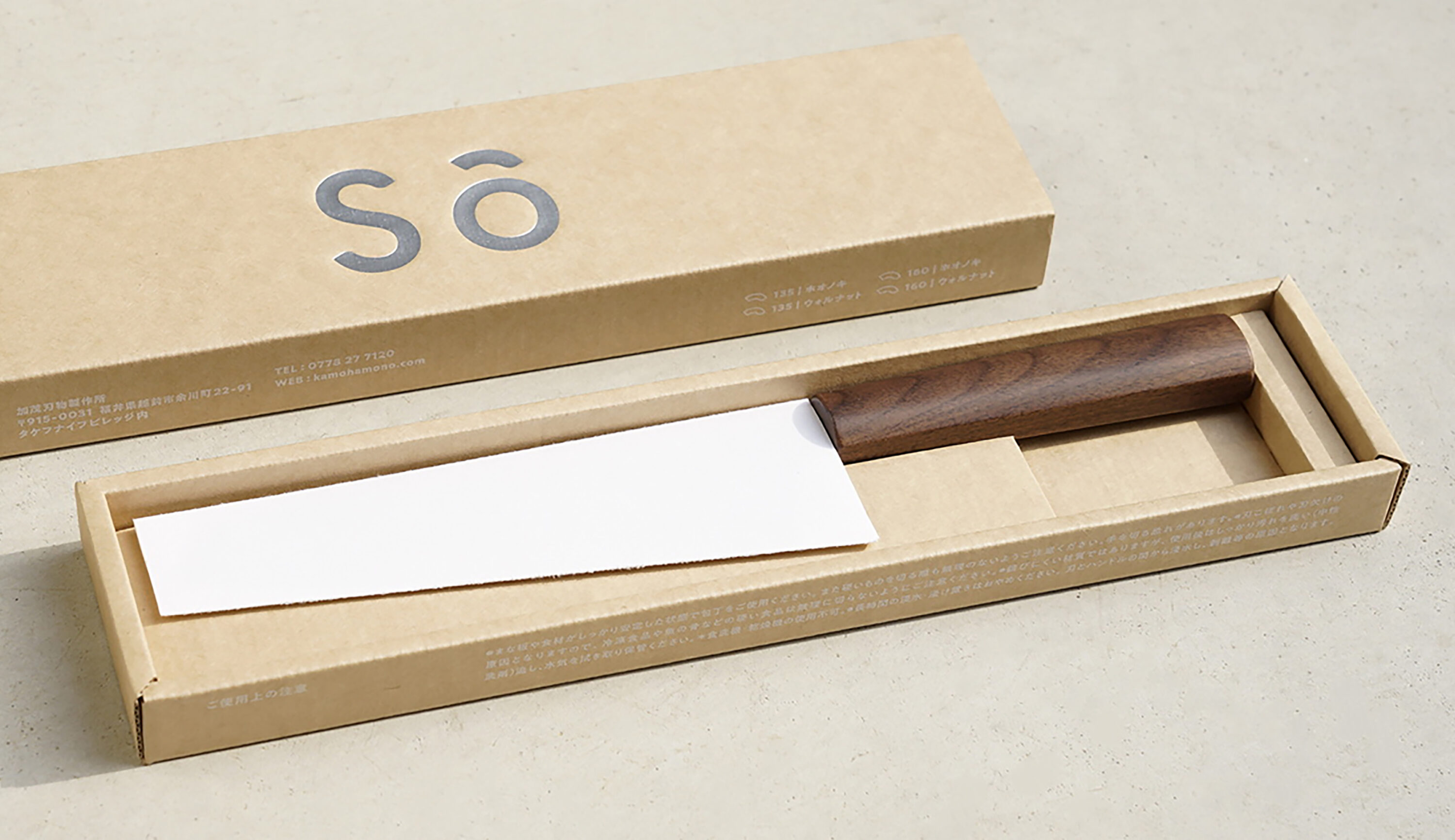
「sō」のパッケージは、包丁の機能性やストーリーを引き立てる静かな佇まいを意識して設計を行った。素材には素朴であたたかみのあるクラフト紙を使用し、使い手の生活に自然と溶け込むやさしい表情に仕上げた。印字は最小限の情報にとどめ、ブランド名「sō」のロゴが中央に凛と浮かび上がるシンプルな構成。グレートーンの銀箔押しによって、和の落ち着きと現代的な印象を両立させている。
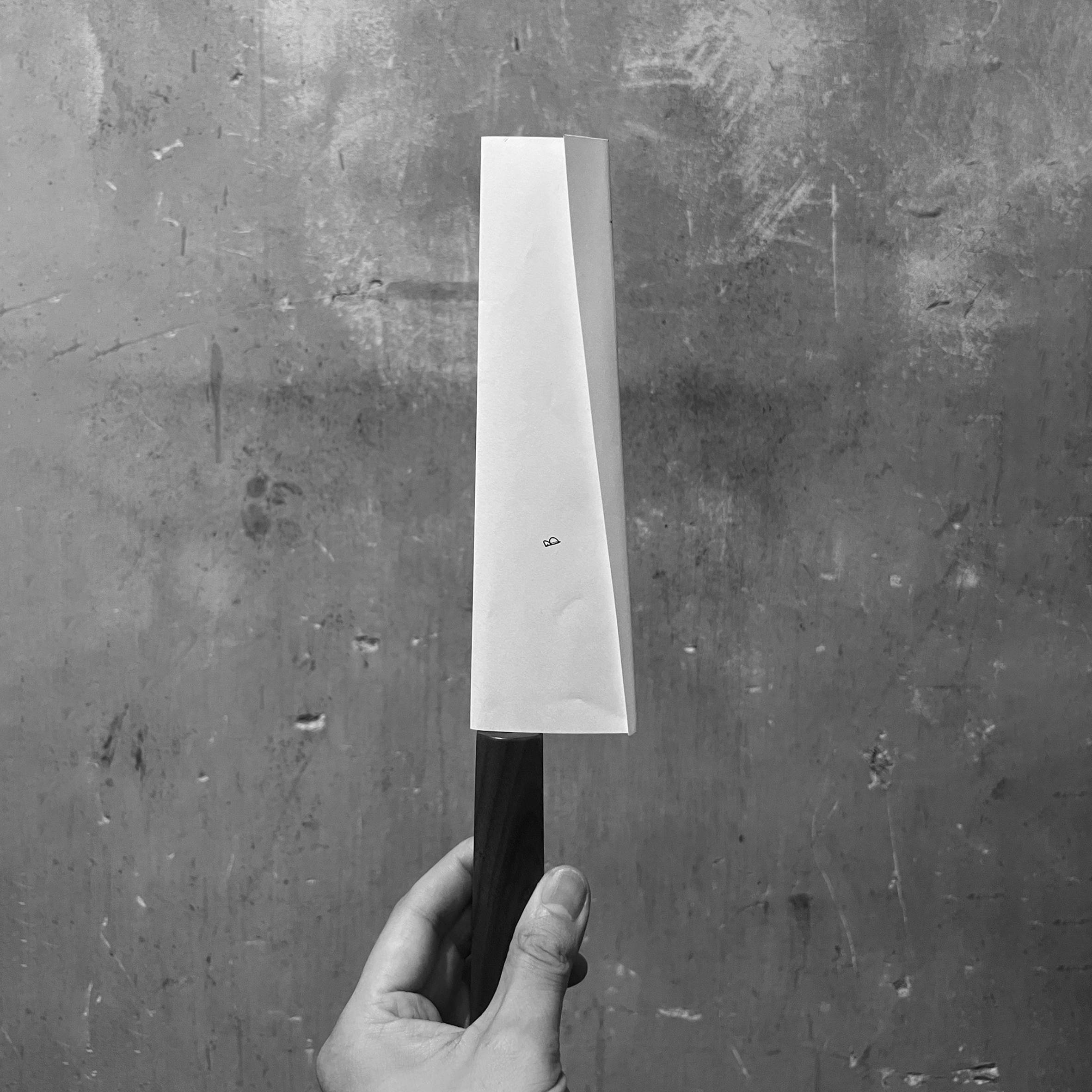
パッケージ内部は刃と柄の形状にあわせたトレイ構造となっており、包丁を美しく納めるだけでなく、安全性と輸送時の安定性にも配慮してる。刃部分を包むスリーブには、福井が誇る伝統素材「越前和紙」を使用。しなやかでありながら強度があり、手にしたときの質感や視覚的な美しさが製品自体を引き立てるデザイン。
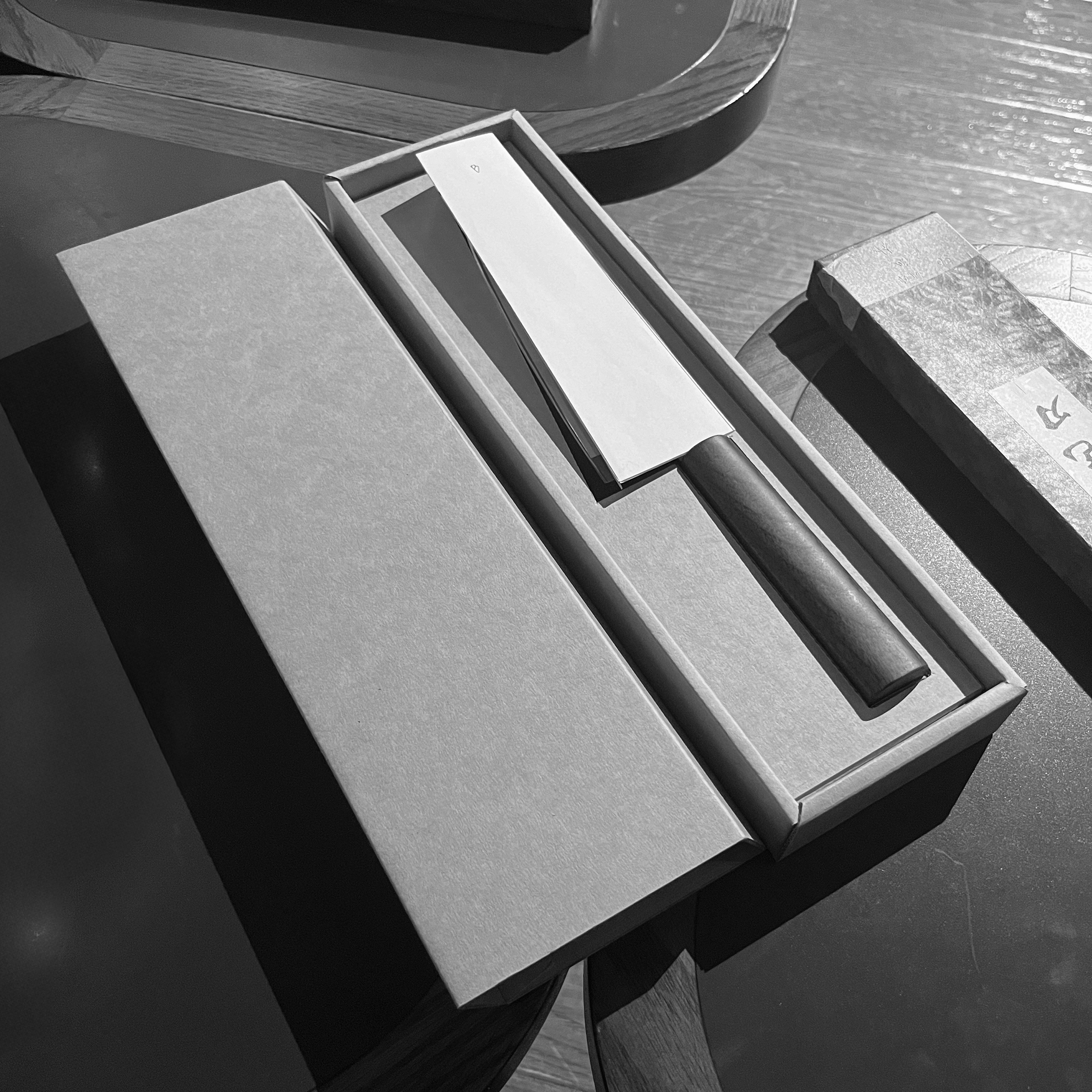
The packaging of “sō” was carefully designed to evoke a quiet presence that enhances both the functionality and the story of the knife. Made from unbleached kraft paper with a natural, warm texture, it offers a gentle expression that blends seamlessly into the user’s daily life. The printed elements are kept to a minimum, allowing the “sō” logo to stand confidently at the center in a simple yet striking layout. The use of silver foil stamping in a subtle grey tone brings together a sense of traditional calm with a modern sensibility.
Inside, the box features a custom-molded tray that follows the contours of the blade and handle, designed not only to cradle the knife beautifully but also to ensure safety and stability during transportation. The blade is further protected by a sleeve made of Echizen washi—a traditional paper from Fukui renowned for its craftsmanship. Soft yet durable, the washi enhances the tactile and visual experience, highlighting the refinement of the product itself.